
Primer Development
- Mar 11, 2018
- 2 min read


Testing diff. materials to see if this makes an impact on the finish of the book. use of colour with watercolour and coloured pencil. rough sketches. beginning to flesh out an idea based on deforestation and the killing of Puerto Rican parrots.
Dip pen was interesting to use for the first time, but unsure if this effect really says anything about the story or context. I enjoyed the colour of the watercolour, but believe I would need to be careful with how much water I could use as I do not want to give off an almost dreamy and soft look that watercolour often can do. To combat this I tried to load my brush with pain and minimal water. Also planning to try a digital approach as I am comfortable with this method and want to compare.
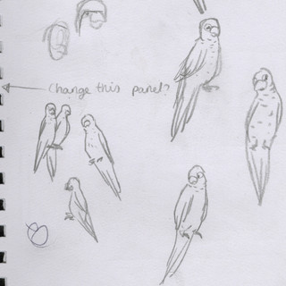
Surprisingly was happy with the zig zag panel first, having thought of it like a staircase, descending as well as the population of the parrots visually to show a metaphorical meaning. The small panels are difficult, as I enjoy the birds being zoned into the middle, and would like some sort of human or man made structures or people in these. Thought about chopping trees but unsure. Trying a fast paced sequence of a man chopping a tree. As the tree falls, the parrots decline in the panel. Effective as a metaphor but clear enough to not take long to understand. Enjoying the mostly green and brown colour pallette but will play in Photoshop with more vibrant colours or softer/muted. Perhaps duller/faded colour as the comic goes down? Localise and isolate parrot in bottom panel? Really want to get a sense of loneliness and isolation at the end.
Particularly had problem with panel on right side near top. Cut out and made a few panels to go over the top. This is how I decided not to add parrot imagery outside of zig zag. Like the three boxes in bottom left and how they look together as a sequence.


Comments